Wednesday, January 30, 2013

Coloring my heart out for Valentine's Day


Hot off the press: two new Valentine cards.

The top one was adapted from a Charles Dana Gibson illustration that was used in a collage last year with the same title as the card greeting. I'm so enamored of the twisted image of a steaming hot Cupid being served up on a silver platter that it's also become a print and, now, this card. I liked paring it back to the original image, though there have been additions such as more steam. 

After toying with various greetings - "love served up on a silver platter," "hunka hunka burning love" - I stuck with "hot plate."

Each card is hand-colored, so no two are alike. Sometimes, the apron is colored; sometimes, the dress, Sometimes, his wing is colored, sometimes, it's not. Sometimes, well, you get the picture. I feel like one of the Victorian women hand-coloring those Godey's fashion engravings I'm so fond of.

The card below also is hand colored. The image is adapted from an illustration in an 1877 German edition of "Schiller's Werte." It was one of the illustrations for his "Don Carlos." I scanned the ornate title page from the volume and used it on the back of the card, which is printed on pale, ash rose card stock. 

Now, to get them to the studio and area shops, then, on my web site!

Friday, January 25, 2013

When beer did, and didn't, flow ...


So, I'm going through that stack of 1932-33 Fortune magazines I've written so much about. Now that the covers have been removed, matted and put up for sale - only four left - it seemed time to rifle through the entire issues to see what could be used in collages and what will be set aside for a future sale.


I'll post more images - specifically of the glorious tire, car and, believe it or not, tomato juice ads. Really. Stunning. But, what caught my eye last night was an illustrated feature on the beer business. Each issue of Fortune had special stories printed on thick, creamy paper that differed from the other paper in the issue. Paper that is actually watermarked with the word "Fortune." Whoa. Now that's a publisher that spared no expense.

The brewery pictured is Philadelphia's Bergner & Engel, which at one time in the late 19th century, was the country's third largest brewery. The illustrations are accompanied by a story titled "If There Were No Prohibition ..." that checks "the economic arguments" for and against repeal of the 18th Amendment that established prohibition. Suffice it to say that prohibition was not kind to B&E. Like many other breweries, it folded.


At least this glorious tribute remains. I can see the three pages, which are in mint condition and were NOT printed back to back, framed and hanging in some new brewery. So, they've been spared the cutting board.

Wednesday, January 23, 2013

House of cards


Just finished updating the Cards With a Past section of the web site with a slew of new greeting cards from two of the lines: Deja View and Retooled. Most of the new ones are hand-colored, which means no two will be alike. I find coloring to be meditative and love to do it late in the day while watching TV and with a glass of wine by my side.

Some of the older cards are being redesigned. There will, for example be a female version of the male "brainiac" card soon. Both will have hand-colored sections of the brain.

The new cards are just finding their way into Cincinnati-area shops, but a few are only available in my studio or via the web site (just click on the price, which takes you to PayPal).

Friday, January 18, 2013

Sorting a garden of paper

                 
It is brrrrrr outside but spring has arrived inside the studio. I vowed that after the new year - and after the Pulp Art exhibit opened - it would be time to tackle the stacks of paper accumulated during the past six months or so.

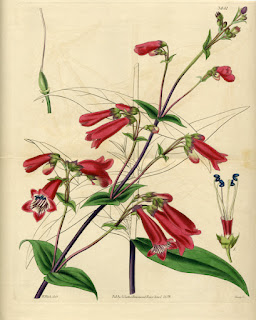
Inevitably, sorting leads to scanning the images I can't bear to part with. These stunning early 19th century lithographs are hand-colored. Some are by well-known printers such as Day & Haghe, pioneers of lithography. Others are from classic magazines such as Curtis' Botanical Magazine and The Floriculture Cabinet.

If they were in mint condition, they'd be highly collectible, and I'd be matting them and selling them in the "Things I Can't Bear to Cut Up" bin. But you can't see it in the scans, because I cleaned them up a bit, these are less than perfect. So, they will go under the knife.

The plan is to use them to create a fantastical garden - maybe as part of The Grand Tour series. Meanwhile, I thought I'd share some favorites from the stash ...


Tuesday, January 15, 2013

Wet and wild: my first crack at marbling paper


I spent Saturday afternoon playing with ink and water. The end result? Gorgeous marbled papers.

I singed up for the workshop - my first attempt at marbling - because I thought the paper might make an interesting addition to collages as backgrounds or, well, who knows what else? I often use antique marbled end papers in pieces and still have a huge stash of it but was itching to try my hand at it.

We dabbed, swirled and rinsed as workshop leader Janice Kagermeier took us through the basic techniques of Suminagashi - an ancient Japanese marbling method. The ink is dropped onto water - just plain old tap water - and spreads across the surface.

The "spread" depends on the ink - some go further than others. The patterns are created by delicately dropping more ink inside the first drop and so on in concentric circles. It's a process that can be meditative and by working with a brush in each hand, you get a bit more control.

We used Japanese inks made just for the purpose and Janice brought along inks NOT to use (they sink to the bottom of the water, create faint patterns or mushy ones). The ink can be manipulated into patterns by blowing on it, cutting through it, fanning it, etc. A neat trick: rub the wooden end of a brush against your face to pick up oil, then, dip the end into the ink to create a clear space where the original paper will show. A "resist" method new to me! You can see how it worked on the paper on the top left; the white areas were created this way.

Each pattern is unique. Unlike other marbling methods, there is less control over the ink, which makes it endlessly fascinating - or frustrating, depending on your temperament. We also experimented with a variety of papers, noting what they were on the back for future reference.

The "workshop" was actually the monthly Study Group meeting of the Cincinnati Book Arts Society. I'm a member of the group, and while I have yet to fully embrace book making, I learn a lot from the meetings. We'll see where these papers turn up ...


At the end of the session,
I dipped two strips of paper into opposite ends of the bin
- and came up with radically different patterns and softer colors.

Monday, January 14, 2013

All together now ... gallery debut of a new series


The "Paper, Scissors, Rock" series is making its gallery - and, well, public - debut this week. The six collages are now hanging - above - at 5th Street Gallery in downtown Cincinnati. It's actually the first time that I've seen them together since they were framed. Here's a closer look at each ... all are professionally framed with museum glass to protect the antique, vintage and recycled papers from UV rays.

© Scissors, Rock, Paper
mixed-media collage
11" x 17" (framed)
$250
© Paper, Scissors, Rock
mixed-media collage
11" x 17" (framed)
$250
© Papers, Scissors, Folk Rock
mixed-media collage
12" x 18" (framed)
$250
© Paper, Rock, Scissors
mixed-media collage
11" x 17" (framed)
$250

© Paper, Scissors, Soft Rock
mixed-media collage
11" x 17" (framed)
$250
© Rock, Paper, Scissors
mixed-media collage
11" x 17" (framed)
$250