Thursday, August 29, 2013

She's got a ticket to ride ...


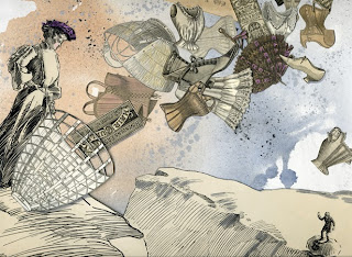
Nice news: two of my recent collages were juried into the fourth annual The Golden Ticket exhibition at Clifton Cultural Arts CenterIt features work by Cincinnati-area artists and includes a wide variety, and I do mean wide. I got a sneak peek at the art when dropping off my pieces last Saturday. The exhibit opens 6-9 p.m. Friday Sept. 5 - awards will be announced at 7 p.m. - and continues through Oct. 2.


© The Grand Tour: Wild things (2013)
mixed-media collage by Sara Pearce
© Shapeshifting: Edith threw caution,
 and perhaps her inheritance, to the wind (2013)

mixed-media collage by Sara Pearce

Wednesday, August 28, 2013

Think about it

© Think About It
mixed-media collage by Sara Pearce

 recycled wrapping paper, paper samples, stencil;
handmade paper; antique medical illustrations;
ink; archival glue; mounted on foam-core board
16.25" x 24.75"

In the spring, I was invited to create a piece for a fall exhibition at the YWCA of Cincinnati's Women's Art Gallery that will commemorate the 50th anniversary of the Civil Rights movement (it opens Friday Oct. 4).

What better day to post the final collage than today - the 50th anniversary of the March on Washington, when The Rev. Martin Luther King Jr. so eloquently spoke about his dream, a dream that should be everyone's.

At first, I wasn't sure whether to be celebratory of the progress made or critical of the progress yet to be made. Then, I landed on an idea that came from my work with old books, and the saying "you can't judge a book by its cover."

Using duplicates of antique medical books, I would cover one with a collaged black cover, the other with a white one. When a viewer opened the covers they would see that both were the same inside. Inside, the plan was to carve out a well in each, and fill it with the anatomical illustrations from the books, trying to make them identical.

After mulling it over for, well, months, another idea emerged. It was based partly on the original one, but more strident, more protest inspired, and a little less like my normal work. Here it is as it evolved ... the last image shows the back of the collage with its recycled wallpaper, wrapping paper, etc. fully revealed.

As I say in my artist's statement:
"My hope is that after the initial glance at the collage, viewers will look more closely, more deeply - past the peeling skin of the surface and into the cut-out letters. Just as we should look more deeply at each other." 


Monday, August 26, 2013

Cunning cat

© Exit strategy: outnumbered, but not outsmarted
mixed-media collage by Sara Pearce
3.25" x 4.5," matted to fit a standard 5" x 7" frame
$35 plus shipping
 

While designing next year's calendars, I noticed that thanks to my Sweet Petites binge there were almost enough cat collages for a cat calendar. Just needed one more, and here it is.

The main image is from a paper company ad found in a stack of vintage design magazines - Communication Arts, Print, etc. They were given to me by Elizabeth Mariner, a Cincinnati graphic designer and co-publisher of Express Cincinnati (a free monthly that covers nonprofit, philanthropic and arts organizations in Greater Cincinnati).

When I saw the dogs and cat, the title popped right into my head, and set the direction for the collage. Happily, my deep and highly-organized stash made it easy to find exactly what I wanted. The background is an antique engineering engraving from a 19th century book bought at a library book sale four years ago. The brain was one of two cut from an ad that I used in another collage, below, in 2011. I knew it would come in handy some day ...


Friday, August 23, 2013

Flat file: Pt. 2


Bet you didn't think there would be a sequel to something as mundane as the flat file post. But, of course, there is. After purchasing giant furniture sliders, I've been moving - pushing might be a better word - the flat file around the studio. In the earlier post, it was in my "gallery" area. Not a good thing.

I knew it was big but, well, not this BIG! I like it between the bookcases, because it creates a kind of library space. That said, I'm not sure whether it's the perfect spot, because it has cut seriously into my "lounge" area.

The best thing about this is that it's making me sort through my stash again. And, yes, ditching some of it. In order to get papers in the file, they have to be flattened first. The pile - above, and below - is getting bigger by the moment. Will the file hold it all? Stay tuned.


Wednesday, August 14, 2013

Flat out cool


Be still my heart. A flat file. Finally. In my studio. It's a used one, actually, but you'd never know it. Previous owners include a downtown gallery and a mixed-media artist. It's a whopping 54" wide x 43" deep.

All you paper geeks out there will appreciate my excitement over this. Now, paper that is rolled and has to be flattened, paper that is stored in hard-to-reach spots beneath work tables, paper that is getting dusty sitting on shelves out in the open, all can be stored in one spot. Any guesses on how long it'll take to fill this beauty?!


Thursday, August 8, 2013

Shooting the moon

© Marvelous Night for a Moon Dance.

So, back in the spring, I created this collage for an art auction of small works to benefit a cancer nonprofit. It didn't sell - yeah, it happens - and was returned to me. The more I looked at it, the less I liked it. I was so smitten by the Victorian scrap of the woman in the moon that I was determined to use it no matter what. Reality check: it was too big, and overshadowed the rest of the collage.

Well, you know what happened next. Time to revise. I tried to salvage the scrap, but damaged it in the process. Sigh. In any case, more planets seemed like the best option ...  

1st try: Not bad, but the planet
overlapping the blue one is too dark.
 

2nd try: The planet's replacement
- luckily I had another one - is too light.

3rd - and final - try: colored pencil softens
the planet and helps it blend in. The
blue planet gets a light glaze
to make the color less intense.
This image was scanned, and the
colors are more true to the original. 

Thursday, August 1, 2013

All tied up, and then some

Hickory
In a post the other day, I wrote about taking apart a few collages to salvage backgrounds created at a workshop a few years ago. Well, in the quest for more intriguing backgrounds, I spent last weekend at a workshop on using natural materials - plants, fruits, nuts, rusted nails, tea leaves and more - to dye paper and fabric. 

Of course, my focus was on paper. The classes were led by fiber artist Judy Dominic at her home in the Ohio countryside. Perfect setting. Perfect weather. Perfect teacher. Here's a peek at what we did ...


Almost everything was tied into bundles
with the paper/cloth wound around sticks
or folded between boards, with plant materials
inside. Some pieces were "tied" in spots with
rubber bands. Results are erratic, which is
party of the beauty of this method.


One of my bundles, and the resulting paper. The dark
areas were where nails were placed. It was also
dipped into a vat of walnut ink, and cooked in a pot
of rusty water.


Another bundle, and the result - showing both
sides of the paper. This was a large piece,
so it was turned around in the pot a few times.
The pot contained copper, which added
brightness to the paper.