Monday, January 27, 2014

Love struck

Okay, between the Tweeting, Facebooking, writing about art, designing "Love Me Tender," my first line of Valentine cards, hunting for paper for two new series of collages, and fighting a cold given to me by my dear husband, well, I've neglecting the blog.

Hoping to remedy that by taking a break from one of my writing gigs. Meanwhile, for those of you NOT on Facebook, here's a peek at the Valentine cards that I have been posting there for the past few weeks, all are available at my studio, and a selection of them can be found at MiCA 12/v, NVISION, and Redtree. And, later this week, at the Bonbonerie.

Adapted from a circa 1920s fold-over Valentine made in the U.S.A.
The publisher and artist are not IDed. I found 5 cards in what, apparently, was
a series during my only trip to the Burlington Antique Show last year.

The illustration is adapted from a 1905 postcard, published
by Raphael Tuck & Sons, London.  It was not mailed, but is addressed
to Mr. John Lauder, Brad St., Beachmont, Mass.  The original featured
the man as a pear, but with serious tweaking, I turned him into an apple.


llustration adapted from a postcard, circa 1910, that was printed in Bavaria.
 The publisher and artist are not identified, and it was not mailed.
 But the art has the softness, and sweetness of an Ellen Clapsaddle illustration. 
We're up in the air on whether the child is a boy or a girl. 
The message on its back? Simply: “Paul Baker from Mary B.”
Illustration adapted from a greeting card, circa 1920s,
that was die-cut. The back of the card shows
the boy's back and the back of the tag, which
reads "Please be mine." The publisher and artist
are not identified but it has the unmistakable style
of a WhitneyMade card.

This sly guy was a dense, black & white engraving from
"Good Things for Little Ones," an antique children's anthology
 of stories, poems, illustrations. It took about 20 hours of work
to "open up" the image - line by line, pixel by pixel -
and to create the final colorization.

The illustration is adapted from a 1922 WhitneyMade postcard,
published by the George Whitney Co. of Worcester, Mass.
It's postmarked Bainbridge, Ohio, 6 a.m., Feb. 14, and was sent
by Catherine Jenkins of Cynthiana, Ohio, to Mr. West, sans a message
other than “Valentine Greetings” on the front of the card.
The artist is not identified. At one point, Whitney was among
the largest publishers of Valentines, even so, it rarely identified its artists.

Illustration adapted from a 1909 postcard published
 by H.W. Taggart Co. (NY). The card was never used.
I've created a 2nd version: two MALE hearts
(both sporting an oh-so-trendy 'stache). 

The illustration is adapted from an antique trade card
advertising the handsome Winsome Banner stove made
by the Baxter Stove Co. of Mansfield, Ohio. As with the cupid card,

I spent a few days at the computer
"opening up" the engraving so that the stove's wonderful decorative details

would pop. And, of course, had to add that blazing fire.
While researching the stove and company, I discovered
 that Mansfield was the stove capital of America 'til the 1970s.
It was home to Tappan & Westinghouse, as well as other manufacturers.


When creating the web image for the "Love Has Gone to My Head" cards,
I put the two cards together, and, voila!, a new idea was born.
Why not put the two hearts together in one other card?
The illustration is adapted from a postcard that is
postmarked West Alexandria, Ohio, Aug 22, 1910.
 It was sent to Alice Tester of Rockford, Ohio, by her niece Alma Dorman
with a message asking her aunt to visit.
A Valentine sent in August? No. On the original, the female heart
is frowning deeply, with big tears running down her cheeks,
and the text reads: "Do you sometimes think of poor little me."


Illustration adapted from an antique chromolithograph
of D.M. Ferry & Co.'s Sweet Pea "Miss Blanche Ferry,"
which the California company introduced in 1889. 

Tuesday, January 14, 2014

A buzz in the night ...

I've written often about being surprised by the trajectory of a collage - the life it seems to take on, all on its own. Back in November, I tried to document my work on a commission to show its progression.

The piece was for the Sleepy Bee Cafe, a Cincinnati breakfast/lunch restaurant. The only request from owner Sandra Gross was that it be at least 25" x 25," and include bees. I knew almost immediately that the collage would have bees buzzing around a lush garden at night, which would make them sleepy in the morning. From there, it was anyone's guess.


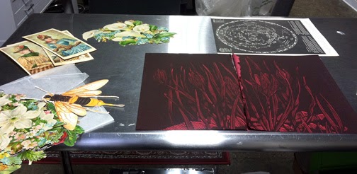
Darkness reigns via endpapers from a vintage
children's book and a black star chart.

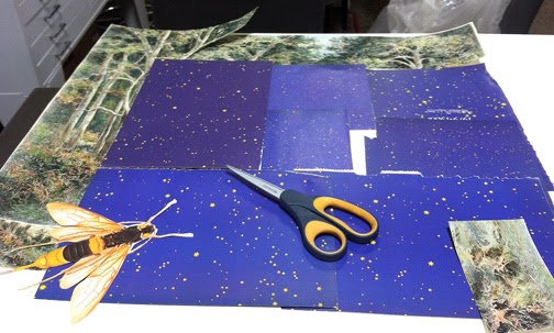
The original background papers are jettisoned
in favor of a brighter night sky (endpapers from a vintage
astrology book), and a blue chart of November's sky.

At left, a strip of vellum with the word dream printed
on it (from a recycled paper sample kit). 

The search for bright botanicals begins with antique, and
vintage prints - some hand colored/painted.

The background is not quite large enough.
Hmm, how about a forest border?
 

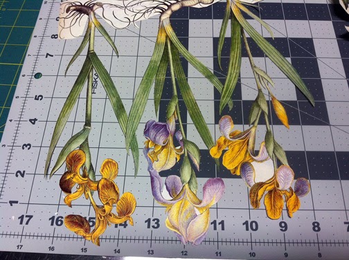
A clump of irises, well into being cut.

More vintage prints (which are reproductions
of antique prints) in various stages of cutting.

Early placement of flowers, some of which need
more trimming of their tangled roots. And, the addition of
handmade paper with leaf inclusions as the bottom border.  

The collage is moved to the drawing table, so it can be viewed
at an angle. More possibilities pile up on top of it, including
a sheet of floral stamps (upper right), and vintage dried flower
arrangements (upper left). 

The final collage, with the addition of more flowers,
a silvery planet, the moon (from a vintage button calendar),
bees (from antique ads at the back of women's magazines),
a blue gazing ball, text on vellum, and a few insects.
The only constant from start to finish? The giant bee.


Sunday, December 15, 2013

You never know what will turn up in the mail


So, on Friday, I received a package from my friend Jo Diamantes, a wonderful Cincinnati book artist. It was taped within an inch of its life. At first, I thought it was something related to the Cincinnati Book Arts Society, which we both belong to. But what could warrant such intense packaging?

I soon found out. Inside was a worn, crumbling scrapbook, circa 1890, and a note from Jo explaining that it had belonged to someone on her mother's side of the family, but she wasn't sure who. She said she had no use for it, but suspected I might. How thoughtful!

It's a small - 6" x 8.5" - album with pressed cardboard covers that mimic leather. The front cover - above - has hand painted roses, and the fading inscription: "A Present from London."

The first "scrap," is a large chromolithograph glued to the inside of the cover. The rest of the book is filled with an eclectic mix of paper: scraps, trade cards, personal calling cards, etc. Here's a quartet of the most arresting images … those with a keen eye will note that the final scrap is similar to one written about last August in a post about Victorian oddities.


Friday, December 13, 2013

Tonight's the night ...


Final Open Studios of the year 6-9 pm tonight at Brazee Street Studios. I will swing my doors open at 5 pm. Have rehung art, restocked cards, and added some holiday goodies. Hope to see you there (1st floor, right across from the gallery, which, by the way, has three pieces by me in the "Multiplicity" exhibit)

Thursday, December 12, 2013

The elf - that would be me - is hard at work

Scenes from the studio in recent weeks, as holiday production geared up ...


It might look like a mess to you, but I call it production!
Various greeting cards fresh off the printer, waiting to be
gathered up, cut, folded, packaged and labeled. Newest
Christmas one - Season's Greetings from Cincinnati - at bottom. 

My first attempt at glass ornaments. My studio home
- Brazee Street Studios - houses a glass school.
On Monday, all Brazee artists were invited to try their hand
at making a trio of ornaments. Different shapes were available
but I stuck with circles. These are pretty rudimentary, but I
enjoyed making them under the guidance of Leah Busch,
who has to be the MOST patient woman in the universe.

My studio tree. It's a work in progress,
and is hung with collages - tags,
ornaments, etc. - that are for sale.
I stuck my glass ornaments on it, too,

Collage tags featuring vintage Santa images
from my Santa card collection (yes, I have one).
Most have been sold, or are for sale at
Nvision in Northside. Hope to whip up more
when I hit the studio today. 

The holiday Tinys - my new line of
petite gift enclosure cards. This side
of the rack is all Santa, but there
are plenty of other designs,
including non-holiday
(see earlier post).